The Header app is responsible for displaying a navigation bar fixed on a store's page upper side. Other blocks that are important for user navigation are found in the Header, for example the store's logo, the minicart, user login and search bar.
Configuration
- Add the
store-headerapp to your theme's dependencies inmanifest.json:
_10 dependencies: {_10 "vtex.store-header": "2.x"_10 }
Now, you are able to use all blocks exported by the store-header app. Check out the full list below:
| Block name | Description |
|---|---|
header-layout.desktop |  header-row blocks. |
header-layout.mobile | Defines the Header layout for mobile device through header-row blocks. |
header-row | |
header-border | Adds a 1px margin to a Header row. |
header-force-center | Centralizes its children blocks in a Header row. |
header-spacer | Adds spacing between blocks throughout a Header row. |
- Declare the two
header-layoutblocks, allowing you to define how the Header should be displayed for both mobile and desktop:
_10{_10 "header": {_10 "blocks": [_10 "header-layout.desktop",_10 "header-layout.mobile"_10 ]_10 },
:information_source: The Header does not need to be declared in a specific template of your theme, once the app is defined as default store interface element in the interfaces.json file. This means that Store Framework will reproduce the configurations defined in the file you just created for all store templates behind the scenes. If you want to apply different configurations to each store template, check the advanced configurations section below.
- Configure both
header-layout.desktopandheader-layout.mobile, declaringheader-rowto create Header lines according to your store needs.
_15{_15 "header": {_15 "blocks": [_15 "header-layout.desktop",_15 "header-layout.mobile"_15 ]_15 },_15 "header-layout.desktop": {_15 "children": [_15 "header-row#1-desktop",_15 "header-row#2-desktop",_15 "header-row#3-desktop",_15 "header-row#4-desktop"_15 ]_15 },
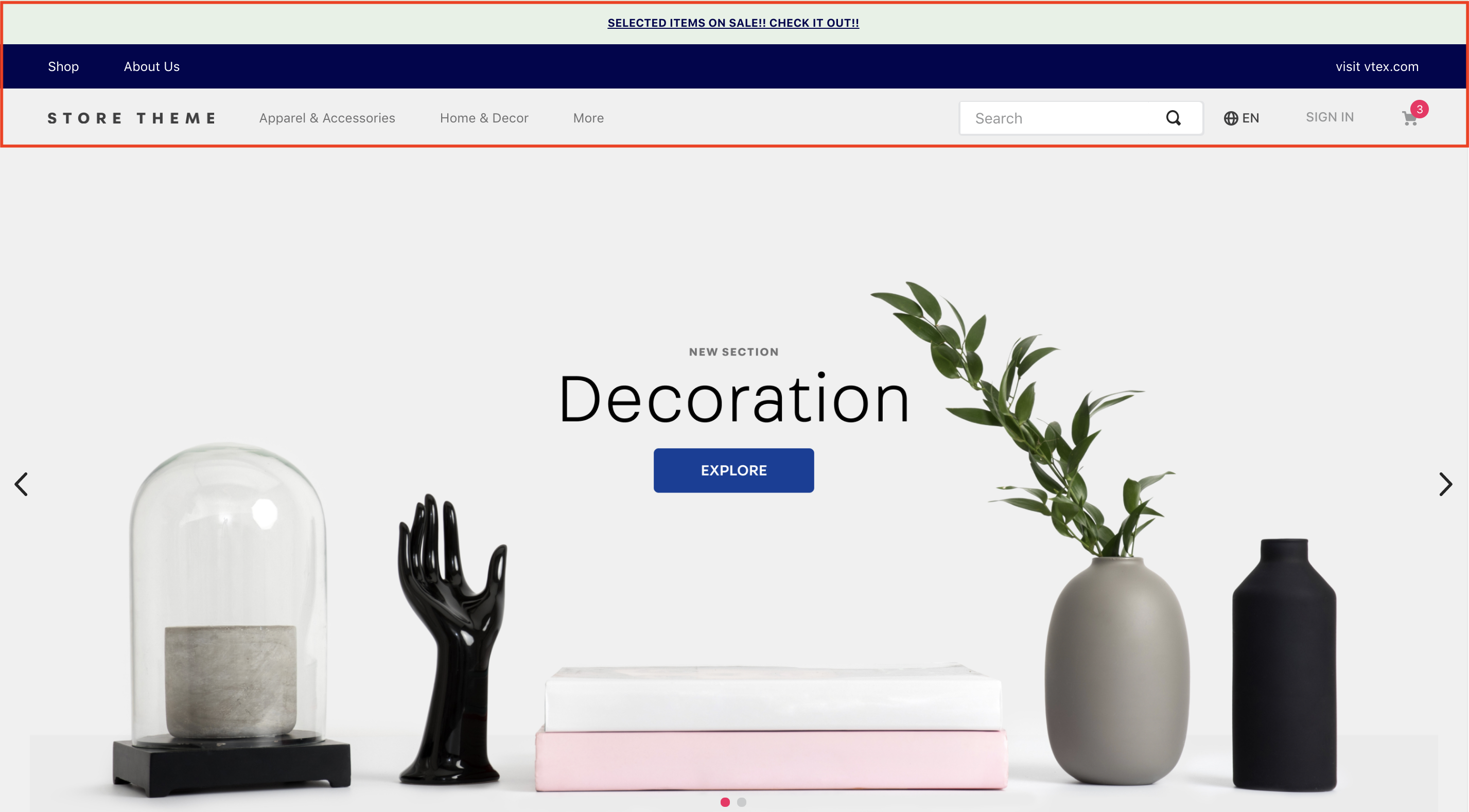
:warning: In the example above, we configured 4 different levels for header-layout.desktop. It will thus be possible to replicate the Header displayed above sheltering the telemarketing functionalities (when activated), a notification, links to pages and every other blocks, such as Logo, Menu, etc. Remember that the number of header-rows should meet your business needs, determining how many Header lines you want to apply to your store.
- Configure each of the
header-rows , applying props and declaring the desired store blocks for each line. To correctly structure your Header, you should check the documentation for each of the desired blocks. The most commonly used are Logo, Minicart and Menu. In the example below, we will configure theheader-row#1-desktopas Telemarketing:
_10"header-row#1-desktop": {_10 "children": [_10 "telemarketing"_10 ],_10 "props": {_10 "fullWidth": true_10 }_10},
header-rowprops:
| Prop name | Type | Description | Default value |
|---|---|---|---|
zIndex | Number | CSS property that controls the vertical stacking order of elements for overlapping. | 0 |
sticky | Boolean | Whether the Header margin should be fixed on the layout (true) or not (false) | false |
fullWidth | Boolean | Whether the Header should take the full width of the screen or not | true |
inverted | Boolean | Whether the row will use the base color (false) or the inverted base color (true) as defined in styles.json. | false |
:warning: Repeat step 4 for any other header-rows you may have in the header-layout.desktop. Remember to declare the desired blocks for each row, as we declared the Telemarketing block for the header-row#1-desktop, and properly configure all blocks using props. Once it is all finished, redo steps 3 and 4 to define your header-layout.mobile as well.
Three blocks can be added as header-row's children in order to customize your Header row layout: header-border, header-force-center and header-spacer.
header-border:
When declared, the header-border block adds a 1px margin to your store's Header.
_14"header-row#2-desktop": {_14 "children": [_14 "header-border",_14 "notification.bar#home"_14 ],_14 "props": {_14 "fullWidth": "true"_14 }_14},_14"notification.bar#home": {_14 "props": {_14 "content": "SELECTED ITEMS ON SALE! CHECK IT OUT!"_14 }_14},
| Prop name | Type | Description | Default value |
|---|---|---|---|
sticky | Boolean | Whether the Header margin should be fixed in the layout or not | false |
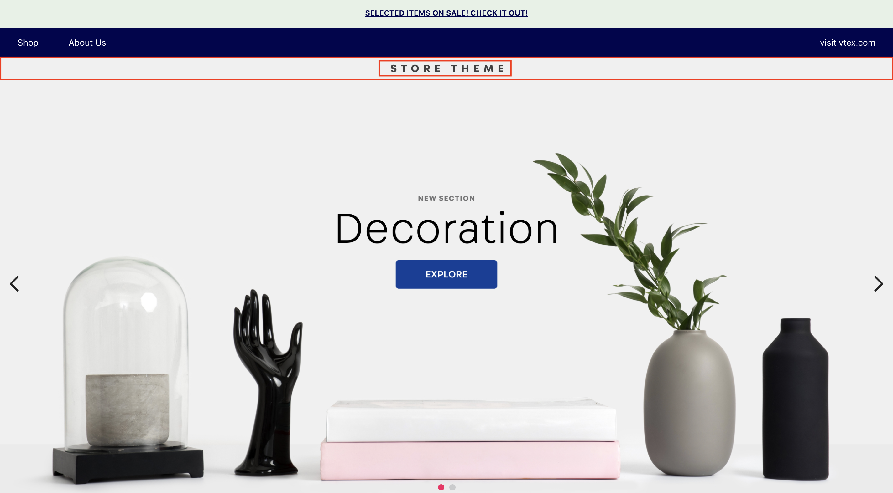
header-force-center
When passed on, the header-force-center centralizes its children blocks in a Header row, for example:
_24"header-row#4-desktop": {_24 "props": {_24 "blockClass": "main-header",_24 "horizontalAlign": "center",_24 "verticalAlign": "center",_24 "preventHorizontalStretch": true,_24 "preventVerticalStretch": true,_24 "fullWidth": true_24 },_24 "children": ["header-force-center"]_24}, _24"header-force-center": {_24 "children":[_24 "logo#desktop"_24 ]_24},_24"logo#desktop": {_24 "props": {_24 "title": "Logo",_24 "href": "/",_24 "url": "https://storecomponents.vteximg.com.br/arquivos/store-theme-logo.png",_24 "width": "180"_24 }_24},
header-spacer:
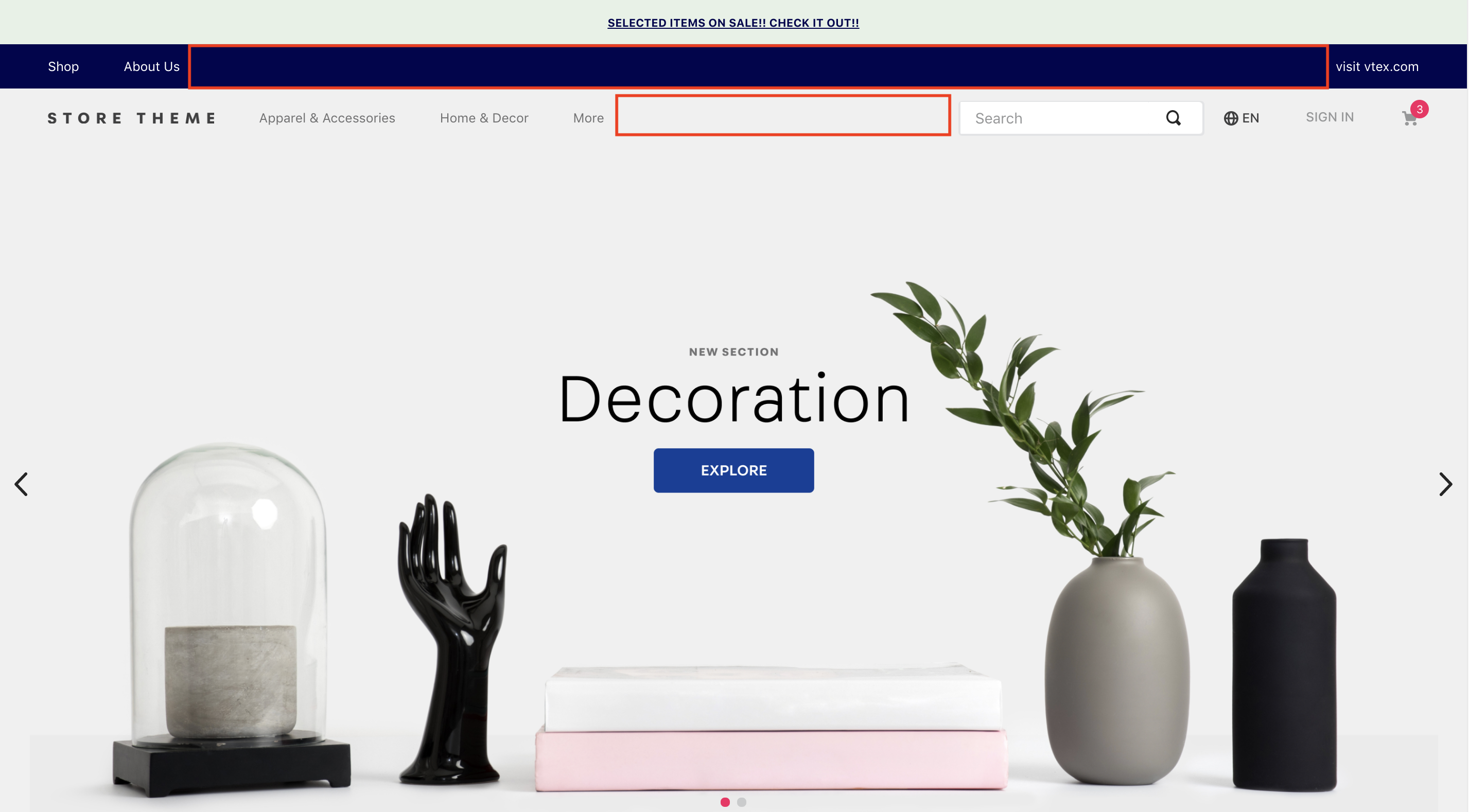
The header-spacer is tasked with adding spacing between blocks throughout the Header rows. For example:
_11"header-row#3-desktop": {_11 "children": [_11 "vtex.menu@2.x:menu#websites",_11 "header-spacer",_11 "vtex.menu@2.x:menu#institutional"_11 ],_11 "props": {_11 "blockClass": "menu-link",_11 "inverted": "true"_11 }_11},
In practice, it will make all blocks declared before it position themselves to the left on the screen, whereas blocks that are declared after will be positioned to the right. Considering that the Menus were properly declared and configured in the theme code, we would have the following:
Advanced configuration
Automatic behind the scenes Header reproduction in every store template is only possible because it is defined as default store interface elements in the interfaces.json file from Store Theme.
This definition in interfaces.json enables Store Framework to identify the Header block declared just once in a blocks.jsonc file and reproduce it as default for all other templates.
To overwrite this automatic duplication in interfaces.json and use new configurations in different templates, refer to the step-by-step of the following recipe: Customizing the Header and Footer.
Customization
In order to apply CSS customizations in these and other blocks, follow the instructions given in the recipe on Using CSS Handles for store customization.
| CSS Handles |
|---|
container |
leanMode |
topMenuContainer |
topMenuLogo |
topMenuSearchBar |
topMenuIcons |
topMenuCollapsible |
forceCenter |
forceCenterInnerContainer |
headerBorder |
headerSpacer |
headerStickyRow |
headerRowContentContainer |