The Product Customizer component can be used on the Product Details Page (PDP) to display attachments and/or a subscription form.
An attachment is the optional and cost-free customization of a product.
Product subscriptions facilitate recurring sales by automatically scheduling the purchase of a specific product at the frequency requested by the customer.
Before you start
- If you plan to use the Product Customizer component to display attachments, make sure to set up Assembly Options.
- If you plan to use the Product Customizer component to display a subscription form, make sure to set up Subscriptions. The Product Customizer integration with the Subscription module is native and will be automatically enabled when subscription settings are detected.
Configuring Product Customizer
- Add the
product-customizerapp to your theme dependencies in themanifest.json. For example:
_10 dependencies: {_10+ "vtex.product-customizer": "2.x"_10 }
- Add the
product-assembly-optionsblock as a child of thestore.producttemplate (PDP template). This is enough to enable the subscription form.
_11 "store.product": {_11 "children": [_11 "flex-layout.row#product-breadcrumb",_11 "flex-layout.row#product-main",_11 "flex-layout.row#description",_11 "shelf.relatedProducts",_11 "product-reviews",_11 "product-questions-and-answers",_11+ "product-assembly-options"_11 ]_11 },
- Declare the
product-assembly-optionsprops for your scenario.
Displaying attachments (optional)
- To display attachments of a product on the Product Detail Page (PDP), declare the
product-assembly-optionsblock and add theassembly-option-input-valuesblock as its child.
_10 "product-assembly-options": {_10 "children": [_10 "assembly-option-input-values"_10 ]_10 },
- Use the blocks exported by the
product-customizerapp to create a solution that best suits your specific scenario.
| Block name | Description |
|---|---|
assembly-option-item-image | Displays the attachment image. |
assembly-option-item-quantity-selector | Displays a quantity selector. |
assembly-option-item-name | Displays the attachment name. |
assembly-option-item-price | Displays the attachment price. |
assembly-option-item-customize | Displays the Customize button. When clicked, it opens a modal that allows customers to customize the attachment. |
assembly-option-item-children-description | Displays a summary with all selected attachments. |
- Declare the props for the chosen blocks according to your scenario. For example:
_10"product-assembly-options": {_10 "props":{_10 "initiallyOpened": "always"_10 },_10 "children": [_10 "flex-layout.row#product-assembly-options",_10 "assembly-option-input-values"_10 ]_10},
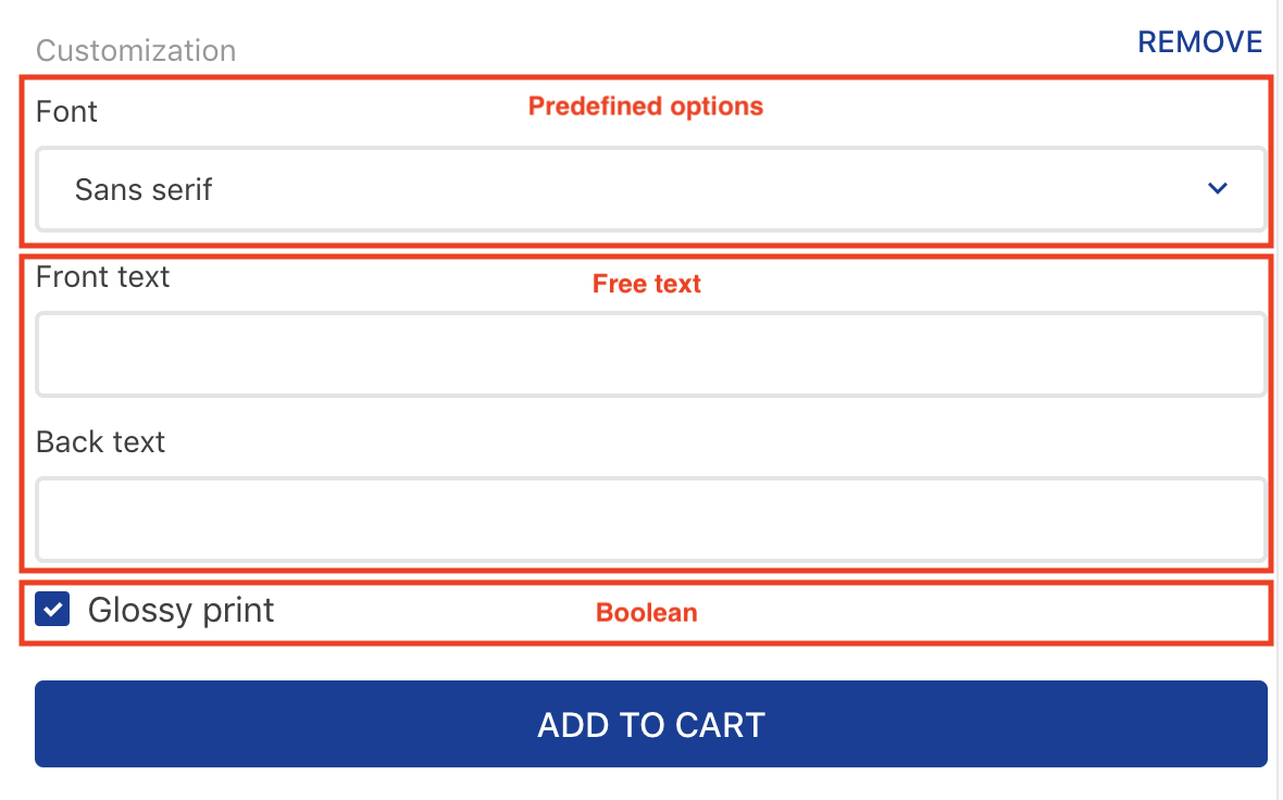
While building your solution, note that you can receive inputs from three types of attachments:
- Predefined options: Predefined attachment options set in the
Permitted Valuesfield. Set up theoptionsDisplayprop from theassembly-option-input-valuesblock to define how these options are displayed. - Free text: Text input. Depending on the value set in the Maximum Number of Characters field in the attachment settings, shoppers may or may not have a character limit for this attachment.
- Boolean: Boolean attachment options set in the
Permitted Valuesfield. Customers can select the attachment by clicking the checkbox.
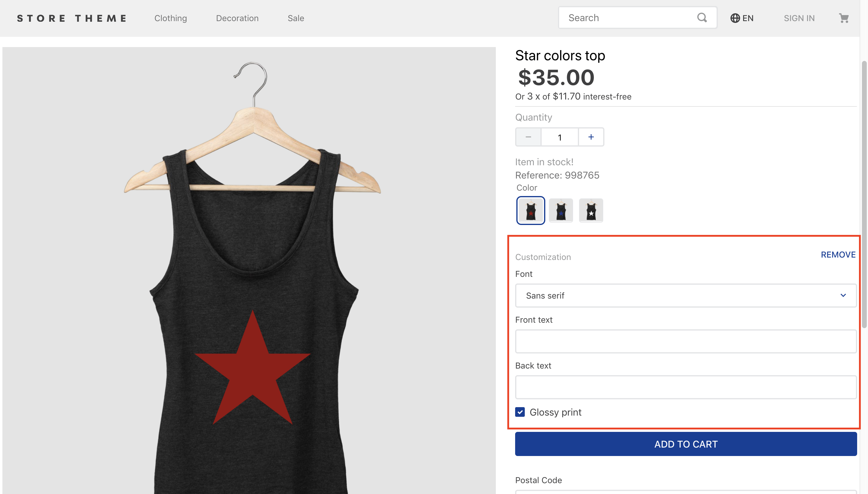
Check the following example where the three attachment types are implemented:
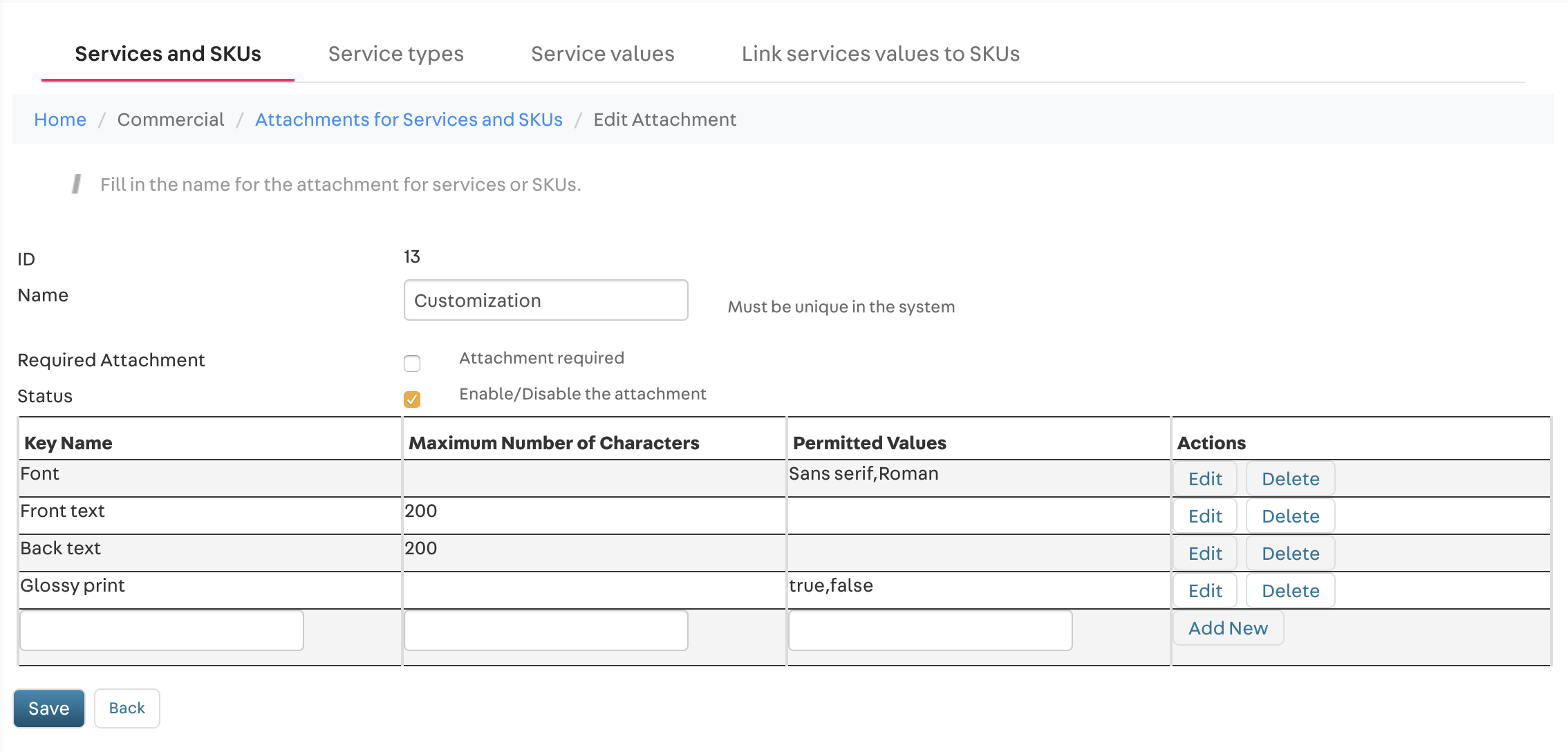
Check out below how the product attachment displayed above was added to the Catalog:
When an attachment is set as required, all attachment options are automatically made available to consumers. On the other hand, if an attachment is not required, the Add customization button is rendered, as shown in the example above. This gives shoppers the option to add or not an attachment to their product.
Also, keep in mind that the Checkout does not natively display the customized product option selected by the customer. To display the product in the Checkout with the selected attachments, it is necessary to customize the Checkout page, allowing it to read and render product information.
Props
product-assembly-options props
| Prop name | Type | Description | Default value |
|---|---|---|---|
initiallyOpened | enum | Defines whether the customization box will be opened even if an attachment is not required (always) or if the customization box will be opened only if the attachment is required (required). | required |
assembly-option-input-values props
| Prop name | Type | Description | Default value |
|---|---|---|---|
optionsDisplay | enum | Defines whether a checkbox (box) or a dropdown list (select) will be used to select the attachment pre-defined options. | select |
assembly-option-item-customizeprops
| Prop name | Type | Description | Default value |
|---|---|---|---|
buttonProps | object | Defines the behavior of the Customize button. In addition to the collapse prop, the buttonProps object can include child blocks to build the content of the modal triggered when the button is clicked. | undefined |
buttonPropsobject:
| Prop name | Type | Description | Default value |
|---|---|---|---|
collapse | enum | Customize button positioning. Possible values are: left or right. | left |
Customization
To apply CSS customizations to this and other blocks, please see the Using CSS handles for store customization guide.
| CSS handles |
|---|
booleanInputValue |
inputValueOptionBox |
itemContainer |
modalViewDoneButton |
modalViewProductContainer |
modalViewProductImage |
modalViewProductInfos |
modalViewProductName |
multipleItemQuantitySelector |
optionsInputValue |
optionsInputValueDropdown |
optionsInputValueLabel |
optionsInputValueLabelContainer |
optionsInputValueOptionBoxContainer |
productAssemblyGroupName |
productAssemblyGroupNameRow |
productAssemblyGroupRequiredTag |
productAssemblyOptionItemCustomize |
productAssemblyOptionItemCustomize__label |
productAssemblyOptionItemImage |
productAssemblyOptionItemName |
textInputValue |