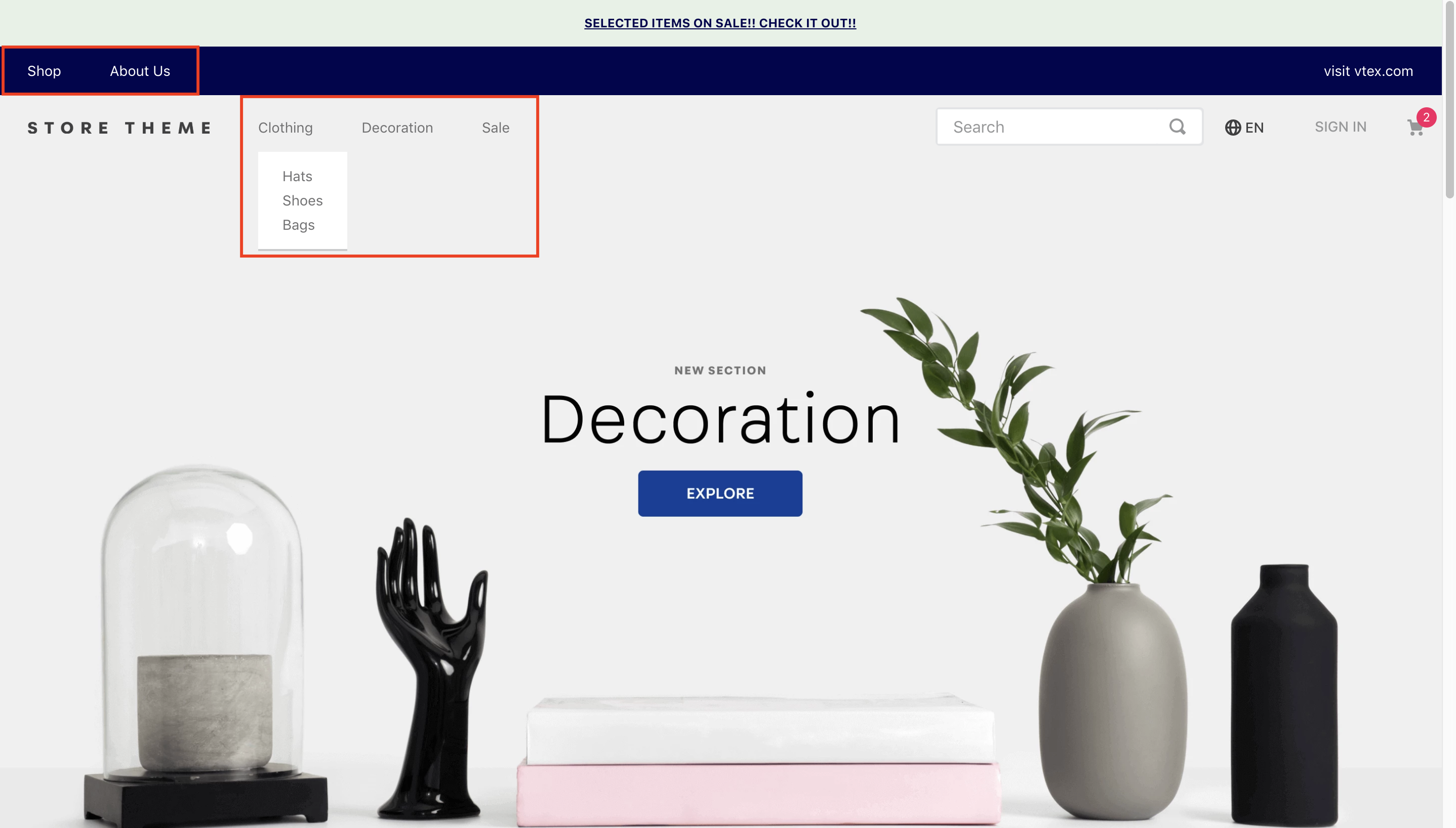
VTEX Menu is a store component that displays a bar containing links and dropdown submenus.
Configuration
- Import the menu app to your dependencies as
manifest.json. For example:
_10 "dependencies": {_10 "vtex.menu": "2.x"_10 }
-
Add the
vtex.menu@2.x:menublock to the store header template. -
Configure the
menu-itemblocks to build the store menu options. These can be declared in two ways invtex.menu@2.x:menu: as children or as props. The advantage of the second type ofmenu-itemconfiguration is that Site Editor can be used to edit the blocks.
menu-item as children
Example:
_28"vtex.menu@2.x:menu#websites": {_28 "children": [_28 "menu-item#shop",_28 "menu-item#about-us"_28 ]_28},_28"menu-item#shop": {_28 "props": {_28 "id": "menu-item-shop",_28 "type": "custom",_28 "highlight": false,_28 "itemProps": {_28 "type": "internal",_28 "href": "#",_28 "noFollow": false,_28 "tagTitle": "Shop",_28 "text": "Shop"_28 },_28 "iconProps": {_28 "id": "bnd-logo",_28 "size": 16,_28 "viewBox": "0 0 16 16",_28 "activeClassName": "rebel-pink",_28 "mutedClassName": "c-action-primary"_28 },_28 "iconToTheRight": true_28 }_28}
menu-item as props
Example:
_30"vtex.menu@2.x:menu#websites": {_30 "props": {_30 "items": [_30 {_30 "id": "menu-item-shop",_30 "type": "custom",_30 "highlight": false,_30 "itemProps": {_30 "type": "internal",_30 "href": "#",_30 "noFollow": false,_30 "tagTitle": "Shop",_30 "text": "Shop"_30 }_30 },_30 {_30 "id": "menu-item-about-us",_30 "type": "custom",_30 "highlight": false,_30 "itemProps": {_30 "type": "internal",_30 "href": "/about-us",_30 "noFollow": false,_30 "tagTitle": "about-us",_30 "text": "About Us"_30 }_30 }_30 ]_30 }_30}
You can define a submenu for a menu item:
_24"menu-item#shop": {_24 "props": {_24 "type": "custom",_24 "highlight": false,_24 "itemProps": {_24 "type": "internal",_24 "href": "#",_24 "noFollow": false,_24 "tagTitle": "Shop",_24 "text": "Shop"_24 },_24 },_24 "blocks": ["vtex.menu@2.x:submenu#shop"] // Defining a submenu_24},_24"vtex.menu@2.x:submenu#shop": {_24 "children": [_24 "vtex.menu@2.x:menu#submenushop"_24 ]_24},_24"vtex.menu@2.x:menu#submenushop": {_24 "children": [_24 "menu-item#shop"_24 ]_24}
The available menu-item block props are as follows:
| Prop name | Type | Description | Default value |
|---|---|---|---|
type | string | Menu item type, either category or custom | category |
id | string | Menu item ID | undefined |
highlight | boolean | Whether the item has a highlight | undefined |
iconPosition | string | Icon position relative to the menu item text. Either to the left or right. | left |
iconProps | IconProps | Icon props | undefined |
onMountBehavior | enum | Whether the submenu should always be automatically displayed when its parent is hovered/clicked on (open) or (close). | closed |
itemProps | CategoryItem or CustomItem | Item props | undefined |
classes | CustomCSSClasses | Used to override default CSS handles. To better understand how this prop works, we recommend reading about it here. Please note that this is only useful when importing this block as a React component. | undefined |
- For icons in the menu items:
| Prop name | Type | Description | Default value |
|---|---|---|---|
id | string | Icon ID | N/A |
isActive | boolean | Whether or not the item is active | true |
size | number | Icon size | 16 |
viewBox | string | Icon view box | 0 0 16 16 |
activeClassName | string | Icon classname when isActive is true | N/A |
mutedClassName | string | Icon classname when isActive is false | N/A |
- For category-related menu items:
| Prop name | Type | Description | Default value |
|---|---|---|---|
categoryId | number | Item category ID | N/A |
text | string | Menu item text | N/A |
- For customized items:
| Prop name | Type | Description | Default value |
|---|---|---|---|
type | string | Menu item type, either internal or external | internal |
href | string | Link to where the menu item leads | N/A |
noFollow | boolean | No follow attribute | N/A |
tagTitle | string | Menu item tag | N/A |
text | string | Menu item text | N/A |
Customization
To apply CSS customizations to this and other blocks, please follow the instructions in Using CSS Handles for store customization.
| CSS Handle |
|---|
accordionIcon--isClosed |
accordionIcon--isOpen |
accordionIcon |
container |
linkLeft |
linkMiddle |
linkRight |
menuContainerNav |
menuContainer |
menuItemInnerDiv |
menuItem |
menuItem--isOpen |
menuItem--isClosed |
menuLinkDivLeft |
menuLinkDivMiddle |
menuLinkDivRight |
menuLinkNav |
renderLink |
styledLinkContainer |
styledLinkContent |
styledLinkIcon |
styledLink |
submenuAccordion |
submenuColumn |
submenuContainer |
submenuWrapper--isClosed |
submenuWrapper--isOpen |
submenuWrapper |
submenu |