Slider Layout is a flexible solution for building block sliders in VTEX Store Framework, such as a carousel component.

To use the Slider layout as a substitute for the Carousel app, read the Building a Carousel through lists and Slider Layout documentation.
Google Analytics 4 Integration
Slider Layout enables you to integrate your component with Google Analytics 4.
The integration happens through the GA4 view_promotion event, which is typically associated with the promotion banners carousel displayed by the Slider Layout.
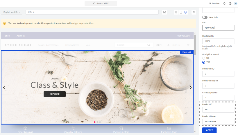
By integrating with Google Analytics 4, you can set the Product ID and Product Name, and position of your promotion on Site Editor to be shown on a Google Analytics dashboard.
To set this up, go to the VTEX Admin, access Storefront > Site Editor, and open the image settings of the internal promotion you want to track. These settings are displayed on the right side of the page.
For more information about managing your page content, read Managing page and template content.
After setup, Google Analytics can track your internal promotions and generate reports of their views, clicks, click-through rate, conversions, and revenue.
Configuration
- Add the
slider-layoutapp to your theme dependencies in themanifest.jsonfile:
_10"dependencies": {_10 "vtex.slider-layout": "0.x"_10}
Now, you can use all blocks exported by the slider-layout app. See the complete list below:
| Block name | Description |
|---|---|
slider-layout |  children list blocks. |
slider-layout-group | Enables you to keep a group of slider-layout blocks synched with each other. For more information about this, see the Advanced configuration section below. |
- Add the
slider-layoutblock to your template. For example:
_29 "slider-layout#text-test": {_29 "props": {_29 "itemsPerPage": {_29 "desktop": 1,_29 "tablet": 1,_29 "phone": 1_29 },_29 "infinite": true,_29 "showNavigationArrows": "desktopOnly",_29 "blockClass": "carousel"_29 },_29 "children": ["rich-text#1", "rich-text#2", "rich-text#3"]_29 },_29_29 "rich-text#1": {_29 "props": {_29 "text": "Test1"_29 }_29 },_29 "rich-text#2": {_29 "props": {_29 "text": "Test2"_29 }_29 },_29 "rich-text#3": {_29 "props": {_29 "text": "Test3"_29 }_29 },
| Prop name | Type | Description | Default value |
|---|---|---|---|
label | string | aria-label attribute value to be used by the <Slider/> component when rendered. The aria-label value should explicitly tell users what the inspected HTML element does. | slider |
showNavigationArrows | enum | Indicates when navigation arrows should be rendered. Possible values are: mobileOnly, desktopOnly, always, or never. | always |
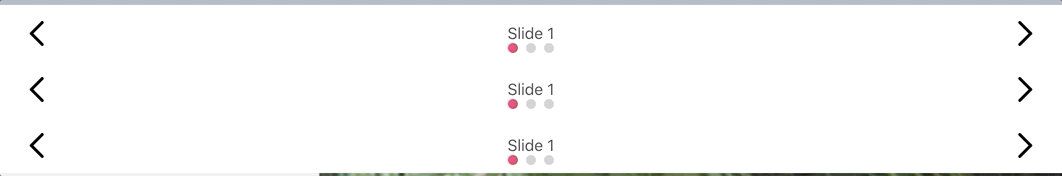
showPaginationDots | enum | Indicates when pagination dots should be rendered. Possible values are: mobileOnly, desktopOnly, always, or never. | always |
infinite | boolean | Determines whether the slider should be infinite (true) or not (false). When this prop is set as false, the slider will have an explicit end for users. | false |
usePagination | boolean | Determines whether the slider should use slide pages (true) or not (false). When this prop is set as false, the slider will use smooth scrolling for slide navigation instead of arrows. | true |
itemsPerPage | object | The number of slider items to be shown on each type of device. For more information about this, see the itemsPerPage object section below. | { desktop: 5, tablet: 3, phone: 1 } |
navigationStep | number / enum | The number of slider items that should be displayed when users click one of the slider arrows. It is also possible to set this prop value as page, meaning that the number of slider items to be displayed when one of the arrows is clicked is equal to the number of slider items set per page (in the itemsPerPage prop). | page |
slideTransition | object | Controls the transition animation between slides based on CSS attributes. For more information about this, see the slideTransition object section below. | { speed: 400, delay: 0, timing: '' } |
autoplay | object | Controls the autoplay feature behavior. For more information about this, see the autoplay object section below. | undefined |
fullWidth | boolean | Determines whether the slides should occupy the full page width, making the arrows appear on top of them (true) or not (false). | true |
arrowSize | number / object | Slider arrows size (height and width) in pixels. This is a responsive prop, which means you can pass to it an object with different values for each breakpoint (desktop, mobile, tablet, and phone). | 25 |
centerMode | enum / object | Defines positioning of the slider elements on the screen. Possible values are: center (elements are centered, allowing users to see a peek of the previous and next slides), to-the-left (aligns elements to the left side, allowing users to see a peek of the next slide, but not the previous one), and disabled (disables the feature, rendering elements on the whole screen without showing a peek of the previous and next slides). Note: This is a responsive prop, which means you can pass to it an object with different values for each breakpoint (desktop, mobile, tablet, and phone). | disabled |
centerModeSlidesGap | number | Number of pixels between slides when centerMode is set to center or to-the-left. | undefined |
itemsPerPageobject
| Prop name | Type | Description | Default value |
|---|---|---|---|
desktop | number | The number of slides to be displayed on desktop devices. | 5 |
tablet | number | The number of slides to be displayed on tablet devices. | 3 |
phone | number | The number of slides to be displayed on phone devices. | 1 |
slideTransitionobject
| Prop name | Type | Description | Default value |
|---|---|---|---|
speed | number | Transition speed (in ms). | 400 |
delay | number | Delay between slide transition (in ms). | 0 |
timing | string | Timing function. | '' |
autoplayobject
| Prop name | Type | Description | Default value |
|---|---|---|---|
timeout | number | Timeout (in ms) between each slide. | undefined |
stopOnHover | boolean | Determines whether the autoplay should stop when users are hovering over the slider (true) or not (false). | undefined |
Advanced configuration
The slider-layout-group block synchronizes the slides rendered by each slider-layout block declared in it.
Therefore, the slider-layout-group does not render any specific component on the store UI. It is really a logical block that only expects to receive a children block list containing the desired slider-layout blocks that should be rendered. For example:
_10{_10 "slider-layout-group#test": {_10 "children": ["slider-layout#1", "slider-layout#2", "slider-layout#3"]_10 }_10}
Below, you can find a practical example using three slider-layout blocks inside of a slider-layout-group. Each slider-layout received three rich-text blocks as children to serve as individual slides:
*All
slider-layoutblocks declared in theslider-layout-groupmust have the same configuration, meaning the same props and values. Due to implementation rules, they can only differ in theirchildrenblock list. Keep in mind that declaringslider-layoutblocks with different configurations will result in unexpected behavior, leading to errors that are not supported by the VTEX Store Framework team.*
Customization
To apply CSS customizations to this and other blocks, follow the instructions given in the recipe on Using CSS handles for store customization.
| CSS handles |
|---|
paginationDot--isActive |
paginationDot |
paginationDotsContainer |
slide--firstVisible |
slide--hidden |
slide--lastVisible |
slide--visible |
slideChildrenContainer |
slide |
sliderArrows |
sliderLayoutContainer |
sliderLeftArrow |
sliderRightArrow |
sliderTrackContainer |
sliderTrack |