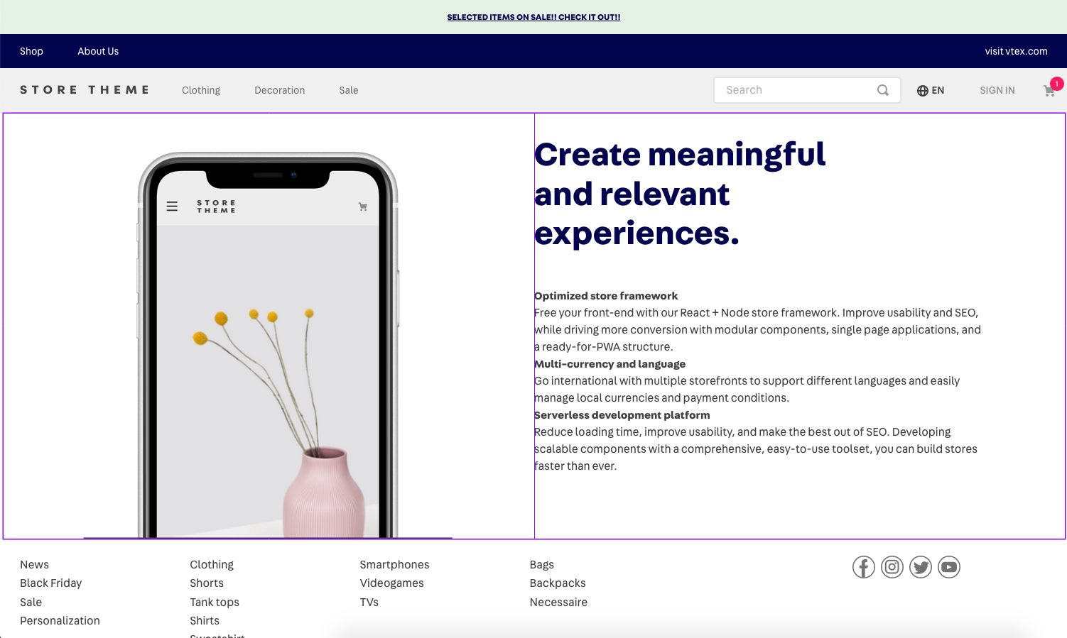
Flex Layout is a layout structure built within VTEX IO Store Framework. It allows building complex custom layouts using the concept of rows and columns, setting the desired block structure and positioning in a page.

Configuration
Flex Layout has two basic building blocks: flex-layout.row and flex-layout.col. You should never use flex-layout.
If you are already familiar with the flexbox layout used in CSS, Flex Layout should be easy to grasp since this is what flex-layout.row and flex-layout.col are using under the hood.
You can use any array of blocks as children for flex-layout.row and flex-layout.col.
The props below support responsive-values, meaning that you can define different values for the same prop based on device screen size, such as mobile and desktop.
flex-layout.row
| Prop name | Type | Description | Default value |
|---|---|---|---|
blockClass | String | Block container class. The set value of this prop functions as a block identifier for CSS customizations. ( | "" |
borderColor | String | The color of the border. | undefined |
borderWidth | 0...5 | A number or string magnitude for applying the bw Tachyons token to the row. | undefined |
border | String | String[] | An array to define on which sides of the row a border should apply (top, right, bottom, left, or all). | undefined |
colGap | 0...10 | A number or string magnitude for applying the pr Tachyons token to the columns in the flex-layout.row. | undefined |
colSizing | equal|auto | Controls the width of the columns in the flex-layout.row. | equal |
fullWidth | Boolean | Whether the component should occupy all the available width from its parent. | false |
horizontalAlign | left|right|center|between|around | Controls horizontal alignment for the items in the flex-layout.row. It defaults to between if colSizing is auto and to left otherwise. | left |
colJustify | enum | Controls the space between columns and borders of the flex-layout.row, following the justify-content CSS property. Possible values are between (no space added between borders and columns) and around (space added). | between |
marginBottom | 0...10 | A number or string magnitude for applying the mb Tachyons token to the row. | undefined |
marginTop | 0...10 | A number or string magnitude for applying the mt Tachyons token to the row. | undefined |
paddingBottom | 0...10 | A number or string magnitude for applying the pb Tachyons token to the row. | undefined |
paddingTop | 0...10 | A number or string magnitude for applying the pt Tachyons token to the row. | undefined |
preserveLayoutOnMobile | Boolean | Whether the flex-layout.row should break into a column layout on mobile. | false |
preventHorizontalStretch | Boolean | Prevents the row from stretching horizontally to fill its parent's width. | false |
preventVerticalStretch | Boolean | Prevents the row from stretching vertically to fill its parent's height with the items-stretch token. | false |
rowGap | 0...10 | A number or string magnitude for applying the pb Tachyons token to columns in the flex-layout.row. | undefined |
htmlId | String | This prop adds an HTML id to flexRow. This allows accessing a page section using links. | undefined |
flex-layout.col
| Prop name | Type | Description | Default value |
|---|---|---|---|
blockClass | String | Block container class. The set value of this prop functions as a block identifier for CSS customizations | "" |
borderColor | String | The color of the border. | undefined |
borderWidth | 0...5 | A number or string magnitude for applying the bw Tachyons token to the column. | undefined |
border | String | String[] | An array to define on which sides of the row a border should apply (top, right, bottom, left, or all). | undefined |
horizontalAlign | left|right|center | Controls horizontal alignment for the items in the flex-layout.col. | left |
marginLeft | 0...10 | A number or string magnitude for applying the ml Tachyons token to the column. | undefined |
marginRight | 0...10 | A number or string magnitude for applying the mr Tachyons token to the column. | undefined |
paddingLeft | 0...10 | A number or string magnitude for applying the pl Tachyons token to the column. | undefined |
paddingRight | 0...10 | A number or string magnitude for applying the pr Tachyons token to the column. | undefined |
preventVerticalStretch | Boolean | Prevents the row from stretching vertically to fill its parent's height with height: 100%, using height: "auto" instead. | false |
rowGap | 0...10 | A number or string magnitude for applying the pb Tachyons token to rows in the flex-layout.col. | undefined |
verticalAlign | top|middle|bottom | Controls vertical alignment for the items in the flex-layout.col. | top |
width | "0...100%"|"grow" | Sets the width of the column. Accepts either a percentage or "grow". | undefined |
App behavior
- The highest level in a flex layout is always a row. Therefore, you can only add a
flex-layout.colinside aflex-layout.row— never as a first-level block. - Every row and column can have as many levels as needed.
- When creating levels, you have to alternate between rows and columns. You can only place columns within a row and rows within a column.
- Keep in mind that the structure that you set in your flex layout does not only affect your code organization, but will also reflect in the way that blocks will be shown and managed through the Site Editor admin. Therefore, it is always important to take the organization of both code and Site Editor into account when planning to apply the flex layout to a page.
To better understand Flex Layout's practical operation, you can access the recipe for Using Flex Layout
Customization
To apply CSS customizations to this and other blocks, follow the instructions given in the recipe for Using CSS Handles for store customization.
| CSS Handles |
|---|
flexColChild |
flexCol |
flexRowContent |
flexRow |