This page is about version 3.59.0 of the app, which is not the most recent version. The latest stable version is 3.130.2.
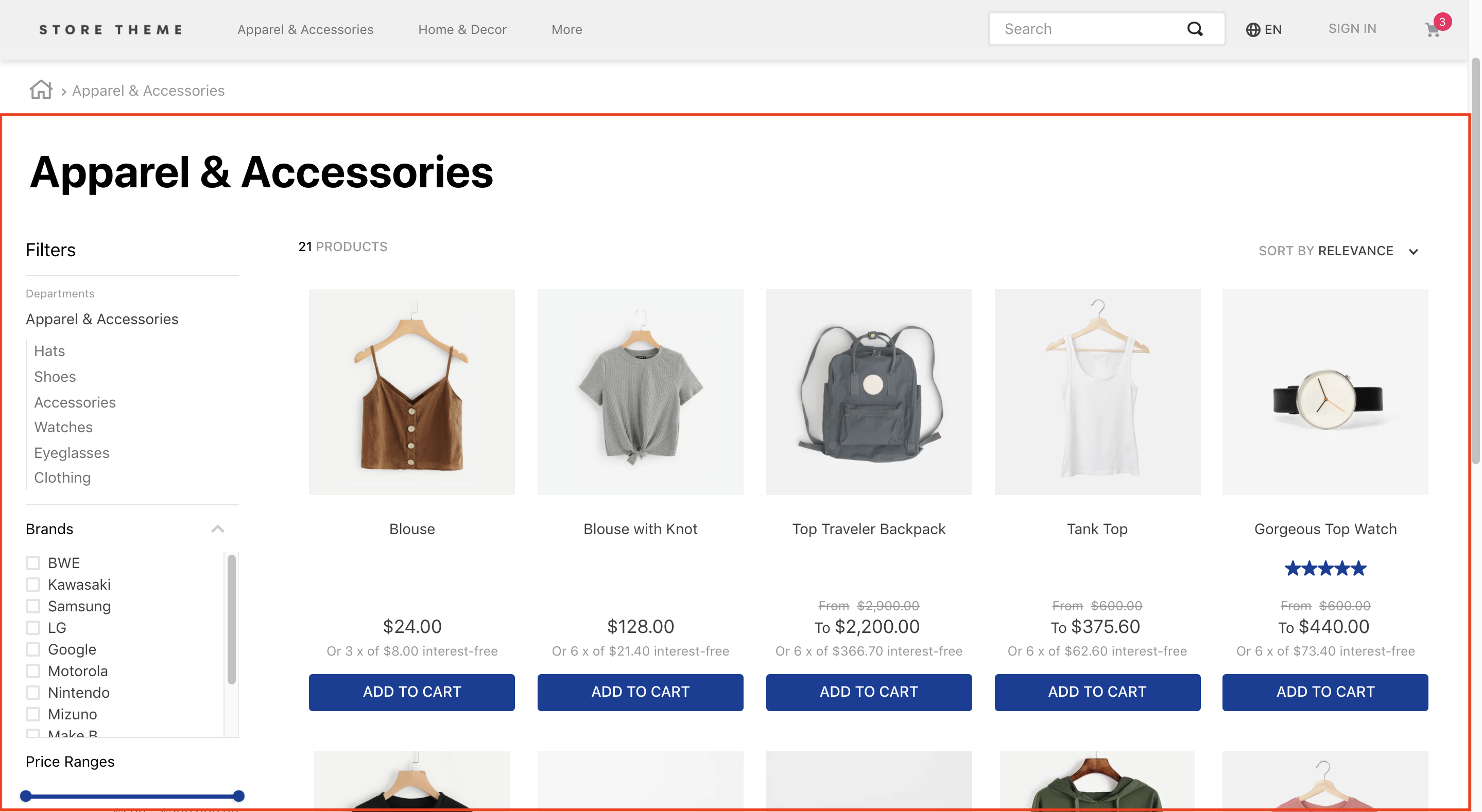
VTEX Search Result app is responsible for handling the result fetched by the VTEX Search API and displaying it to users.
The app therefore exports all store blocks expected in a search results page, such as the filters and the product gallery.
Configuration
Step 1 - Adding the Search Result app to your theme's dependencies
In your theme's manifest.json, add the Search Result app as a dependency:
_10 "dependencies": {_10 "vtex.search-result": "3.x"_10 }
Now, you are able to use all the blocks exported by the search-result app. Check out the full list below:
| Block name | Description |
|---|---|
search-result-layout |  search-result-layout.desktop, search-result-layout.mobile and search-not-found-layout . It must be used in the store.search template since it uses the context provided by the VTEX Search API. |
search-result-layout.customQuery | search-result-layout in scenarios in which the search result will be declared in a template that doesn't fetch Search context, such as Home. It accepts a querySchema prop that executes search custom queries. It also supports three children blocks: search-result-layout.desktop, search-result-layout.mobile and search-not-found-layout . |
search-result-layout.desktop | |
search-result-layout.mobile | Builds the search result page structure for mobile mode. If the search-result-layout.mobile is not provided, the search-result-layout.desktop will be used instead. |
search-layout-switcher | Enables mobile users to switch between the available layout modes. |
search-not-found-layout | Builds the whole search result page structure for scenarios in which no result was fetched. It is rendered whenever users search for a term that doesn't return a product. |
gallery | |
not-found | Block containing a text and a description for the page that was not found in the search. It must be declared as a child of search-not-found-layout. |
search-content | gallery block (if products are found) or the not-found block (if the selected filters lead to an empty search results page). This means that both gallery and not-found must be declared as search-content children. |
store.not-found#search | When configured, it displays a 404 error message whenever the server is not able to return what the browser request was or when it is configured to not handle that request. |
search-products-count-per-page | Displays the total number of products being displayed in the search results page. |
search-products-progress-bar | Displays a progress bar of products being displayed in the search results page. |
order-by.v2 | Allows users to choose the product ordination in the search results page. |
filter-navigator.v3 | Allows users to apply different filters to the search. On mobile, renders a button that, when clicked on, displays all available filters in a sidebar. |
total-products.v2 | Displays the total amount of products found for that search. |
search-title.v2 | Displays a title for the search that was done. |
search-fetch-more | Displays the "Show More" button. This button isn't rendered when the user is on the last page. |
search-fetch-previous | Displays the "Show Previous" button. This button isn't rendered when the user is on the first page. |
search-products-count-per-page | Displays the quantity of products currently on the page. |
sidebar-close-button | Displays an X button on the filter sidebar on mobile. |
search-title.v2 | Displays a title for the search that was done. |
:information_source: The Search Result app data may be displayed on search pages (store.search) or any other desired page. When added to the search page, the block that is used must be the search-result-layout, since it fetches data provided by the template's current search context. If you want to add the app to another page, the block that must be used is the search-result-layout.customQuery.
Step 2 - Adding the Search Result to page templates
According to the desired store page, add the search-result-layout block or the search-result-layout.customQuery to the correct template blocks list. For example:
_10"store.search": {_10 "blocks": ["search-result-layout"]_10}
or
_10 "store.home": {_10 "blocks": [_10 "carousel#home",_10 "shelf#home",_10+ "search-result-layout.customQuery#home"_10 ]_10 }
Now, before declaring all desired blocks for your search result layout, your first need to define how you want the search results to be fetched.
:warning: Remember: on the home page, you define these results through a custom query. On the search template, you just need to use the already provided context.
Step 3 - Defining how the search query data should be fetched
According to your store's scenario, define how the search query data should be fetched using props.
If you are using a search-result-layout, the blocks will define the data that is fetched from the context. If what you are using is a search-result-layout.customQuery, the props should be sent through the querySchema to configure the custom query.
For example:
_11{_11 "store.search": {_11 "blocks": ["search-result-layout"],_11 "props": {_11 "context": {_11 "skusFilter": "FIRST_AVAILABLE",_11 "simulationBehavior": "skip"_11 }_11 }_11 }_11}
or
_17{_17 "store.home": {_17 "blocks": [_17 "carousel#home",_17 "shelf#home",_17 "search-result-layout.customQuery#home"_17 ]_17 },_17 "search-result-layout.customQuery#home": {_17 "props": {_17 "querySchema": {_17 "skusFilter": "FIRST_AVAILABLE",_17 "simulationBehavior": "skip"_17 }_17 }_17 }_17}
:warning: You must define the query for the following search pages: brand, department, category and subcategory. This will allow you to define custom behaviors for each of your store's possible search pages. For example:
_47{_47 "store.search": {_47 "blocks": ["search-result-layout"],_47 "props": {_47 "context": {_47 "skusFilter": "FIRST_AVAILABLE",_47 "simulationBehavior": "skip"_47 }_47 }_47 },_47 "store.search#category": {_47 "blocks": ["search-result-layout"],_47 "props": {_47 "context": {_47 "skusFilter": "FIRST_AVAILABLE",_47 "simulationBehavior": "skip"_47 }_47 }_47 },_47 "store.search#brand": {_47 "blocks": ["search-result-layout"],_47 "props": {_47 "context": {_47 "skusFilter": "FIRST_AVAILABLE",_47 "simulationBehavior": "skip"_47 }_47 }_47 },_47 "store.search#department": {_47 "blocks": ["search-result-layout"],_47 "props": {_47 "context": {_47 "skusFilter": "FIRST_AVAILABLE",_47 "simulationBehavior": "skip"_47 }_47 }_47 },_47 "store.search#subcategory": {_47 "blocks": ["search-result-layout"],_47 "props": {_47 "context": {_47 "skusFilter": "FIRST_AVAILABLE",_47 "simulationBehavior": "skip"_47 }_47 }_47 }_47}
Below you may find all available props to configure your search data (be it by using a context or a custom query through the querySchema block):
| Prop name | Type | Description | Default value |
|---|---|---|---|
maxItemsPerPage | number | Maximum number of items per search page. The maximum value of this prop is 50, if a larger number is passed, the query will fail. | 10 |
orderByField | Enum | Decides which order products must follow when displayed. The possible values are named after the order type: OrderByTopSaleDESC, OrderByReleaseDateDESC, OrderByBestDiscountDESC, OrderByPriceDESC, OrderByPriceASC, OrderByNameASC, OrderByNameDESC or OrderByScoreDESC (relevance score). ASC and DESC stand for ascending order and descending order, respectively. | OrderByScoreDESC |
hideUnavailableItems | boolean | Whether the search result should display unavailable items (true) or not (false). | false |
facetsBehavior | string | Defines the behavior filters will have. When set to dynamic, it restricts the results according to the filters that user have already selected. If set to Static, all filters will continue to be displayed to the user, even is no results exist. | Static |
skusFilter | Enum | Controls SKUs returned for each product in the query. The less SKUs needed to be returned, the more performant your shelf query will be. Available value options: FIRST_AVAILABLE (returns only the first available SKU), ALL_AVAILABLE (only returns available SKUs) and ALL (returns all product's SKUs). | ALL_AVAILABLE |
simulationBehavior | Enum | Defines whether the search data will be up-to-date (default) or fetched using the Cache (skip). The last option should be used only if you prefer faster queries over no having the most up-to-date prices or inventory. | default |
installmentCriteria | Enum | Controls what price should be shown when there are different installments options for it. Possible values are: MAX_WITHOUT_INTEREST (displayes the maximum installment option with no interest attached) or MAX_WITH_INTEREST (displayes the maximum installment option whether it has interest attached or not). | "MAX_WITHOUT_INTEREST" |
Now it is time to structure the search-result-layout block (or the search-result-layout.customQuery). They both necessarily require a child: the search-result-layout.desktop. But you can also provide others, such as the search-result-layout.mobile and the search-not-found-layout.
Since these are layout blocks, you can use Flex Layout blocks to build your search results page.
Step 4 - Defining your search results page layouts and behavior
Structure the search-result-layout or the search-result-layout.customQuery, according to your store's scenario, by declaring their children and then configuring them using Flex Layout blocks and their props. For example:
_19{_19 "search-result-layout": {_19 "blocks": [_19 "search-result-layout.desktop",_19 "search-result-layout.mobile",_19 "search-not-found-layout"_19 ]_19 },_19 "search-result-layout.desktop": {_19 "children": [_19 "flex-layout.row#searchbread",_19 "flex-layout.row#searchtitle",_19 "flex-layout.row#result"_19 ],_19 "props": {_19 "preventRouteChange": true_19 }_19 }_19}
Available props for search-result-layout.desktop, search-result-layout.mobile and search-not-found-layout:
| Prop name | Type | Description | Default value |
|---|---|---|---|
hiddenFacets | Object | Indicates which filters should be hidden. Possible props and their respective values can be found below. | undefined. |
showFacetQuantity | boolean | Whether the result amount in each filter should appear besides its name on the filter-navigator.v3 block as (true) or (false) | false |
blockClass | string | Unique block ID to be used in CSS customization | undefined |
trackingId | string | ID to be used in Google Analytics to track store metrics based on the Search Result block. | Search result |
mobileLayout | Object | Controls how the search results page will be displayed to users when using the mobile layout. Possible props and their respective values can be found below. | undefined |
mobileLayoutObject:
| Prop name | Type | Description | Default value |
|---|---|---|---|
mode1 | Enum | Defines the default layout for the mobile search results page. Possible values are: normal, small or inline. | normal |
mode2 | Enum | Defines which layout will be set for the mobile search results page when users click on the layout selector button. Possible values also are: normal, small or inline. | small |
HiddenFacetsObject:
| Prop name | Type | Description | Default value |
|---|---|---|---|
brands | boolean | Whether Brand filters should be hidden (true) or not (false). | false |
categories | boolean | Whether Category filters should be hidden (true) or not (false). | false |
priceRange | boolean | Whether Price filters should be hidden (true) or not (false). | false |
specificationFilters | Object | Indicates which Specification filters should be hidden. | undefined |
SpecificationFiltersObject:
| Prop name | Type | Description | Default value |
|---|---|---|---|
hideAll | boolean | Whether specification filters should be hidden (true) or not (false). | false |
hiddenFilters | [string] | String array of specification filters that should be hidden. | undefined |
HiddenFiltersString array:
| Prop name | Type | Description | Default value |
|---|---|---|---|
name | string | Name of the specification filter that you want to hide. | undefined |
Step 5 - Using the Flex Layout to build your search results page
From Flex Layout, you will build your search results page using the other blocks that were exported by the Search Result app, such as: gallery, filter-navigator.v3, etc.
Therefore, don't forget to check out the Flex Layout documentation for more on how to configure your search results page.
Below you can find the existing props for each of the blocks, in addition to the the rules that govern them.
galleryblock
The gallery block does not have its own props, but it has its own inner block structure that must be configured using a product-summary-shelf.
This means that any gallery block implementation created must have a product-summary-shelf that in turn must also have its own inner block structure that can be configured.
Check out the Product Summary documentation.
filter-navigator.v3block
| Prop name | Type | Description | Default value |
|---|---|---|---|
layout | Enum | Whether the Filter Navigator layout should be responsive (responsive) or not (desktop). You may use desktop when the Filter Navigator was configured to be displayed in a drawer. | responsive |
maxItemsDepartment | number | Maximum number of departments to be displayed before the See More button is triggered. | 8 |
maxItemsCategory | number | Maximum number of category items to be displayed before the See More button is triggered. | 8 |
initiallyCollapsed | Boolean | Makes the search filters start out collapsed (true) or open (false). | false |
order-byblock
| Prop name | Type | Description | Default value |
|---|---|---|---|
hiddenOptions | [string] | Indicates which sorting options will be hidden. (e.g. ["OrderByNameASC", "OrderByNameDESC"]) | undefined |
The sorting options are:
| Sort option | Value |
|---|---|
| Relevance | "OrderByScoreDESC" |
| Top Sales Descending | "OrderByTopSaleDESC" |
| Release Date Descending | "OrderByReleaseDateDESC" |
| Best Discount Descending | "OrderByBestDiscountDESC" |
| Price Descending | "OrderByPriceDESC" |
| Price Ascending | "OrderByPriceASC" |
| Name Ascending | "OrderByNameASC" |
| Name Descending | "OrderByNameDESC" |
search-fetch-moreblock The "Show More" button that is used to load the results of the next search page. This block is not rendered if there is no next page. Does not need any prop.search-fetch-previousblock The "Show Previous" button that is used to load the results of the previous search page. This block is not rendered if there is no previous page. Does not need any prop.search-products-count-per-pageblock Shows the product count per search page. Does not need any prop.search-products-progress-barblock Shows a progress bar of search results. Does not need any prop.sidebar-close-buttonblock Close button rendered on the top right of the mobile filter sidebar.
| Prop name | Type | Description | Default value |
|---|---|---|---|
size | number | The size of the button icon | 30 |
type | string | The type of the button icon | line |
Customization
In order to apply CSS customization in this and other blocks, follow the instructions given in the recipe on Using CSS Handles for store customization.
| CSS handles |
|---|
accordionFilterItemActive |
accordionFilterItemBox |
accordionFilterItemHidden |
accordionFilterItemIcon |
accordionFilterItemOptions |
accordionFilterItemTitle |
accordionFilterItem |
accordionFilter |
border |
breadcrumb |
buttonShowMore |
categoriesContainer |
categoryGroup |
categoryParent |
container |
dropdownMobile |
filter |
filterAccordionBreadcrumbs |
filterAccordionItemBox |
filterApplyButtonWrapper |
filterAvailable |
filterButtonsBox |
filterClearButtonWrapper |
filterContainer-- + FACET_TYPE |
filterContainer--b |
filterContainer--c |
filterContainer--priceRange |
filterContainer--selectedFilters |
filterContainer--title |
filterContainer |
filterIcon |
filterItem-- + FACET_VALUE |
filterItem--selected |
filterItem |
filterMessage |
filterPopup |
filterPopupArrowIcon |
filterPopupButton |
filterPopupContent |
filterPopupContentContainer |
filterPopupContentContainerOpen |
filterPopupFooter |
filterPopupOpen |
filterPopupTitle |
filterSelected |
filtersWrapper |
filtersWrapperMobile |
filterTemplateOverflow |
filterTitle |
footerButton |
galleryItem |
galleryTitle |
gallery |
layoutSwitcher |
loadingOverlay |
loadingSpinnerInnerContainer |
loadingSpinnerOuterContainer |
orderByButton |
orderByDropdown |
orderByOptionItem |
orderByOptionsContainer |
orderByText |
orderBy |
progressBarContainer |
progressBar |
progressBarFiller |
resultGallery |
searchNotFoundInfo |
searchNotFoundOops |
searchNotFoundTerm |
searchNotFoundTextListLine |
searchNotFoundWhatDoIDo |
searchNotFoundWhatToDoDotsContainer |
searchNotFoundWhatToDoDots |
searchNotFound |
searchResultContainer |
selectedFilterItem |
showingProductsContainer |
showingProductsCount |
showingProducts |
switch |
totalProductsMessage |
totalProducts |